


A Palette Drawn From a Place
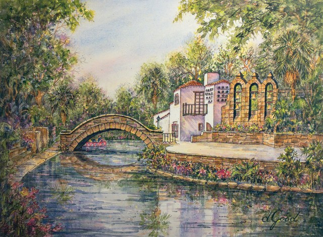
Cool river blue, leafy green, warm stone and terracotta meet in the horizontal River Walk scene. Pale passages give those colors breathing room. The website translates that balance into readable page backgrounds, navigation and accents; the original artwork itself remains unchanged.
These are design interpretations of the scan, not a list of the pigments Donna used. A screen cannot establish the original paint mixtures. The names describe what we see and how those relationships guide the site.
Color Has a Job to Do
Dark text sits on pale backgrounds. The warm stone accent is used for borders and decoration, where it can be lighter without making a sentence hard to read. Deeper blue and red tones support areas that need stronger contrast. Select the named colors below to explore the connections.
Select a named color to explore its role in the website palette.
Reading aloud uses your device’s voice, where supported.