A Conversation Across Subjects
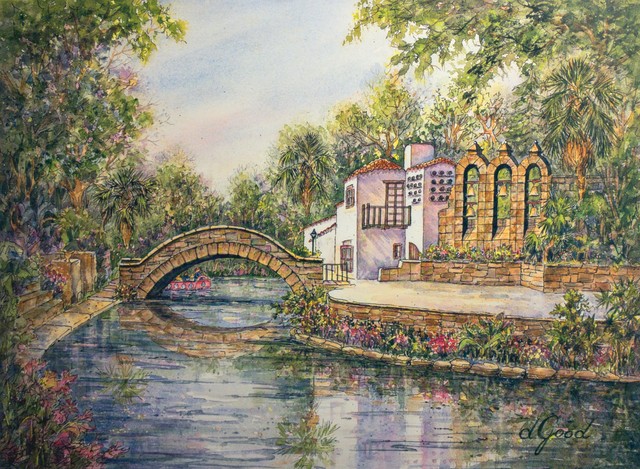
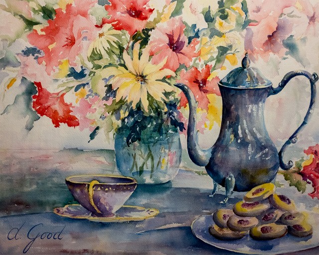
The horizontal River Walk view balances cool water with warmer buildings and stone. Red Bing Cherries on Linen Tablecloth places a blue jug among yellow flowers and warmer details. Afternoon Family Tea repeats blue in the pitcher and surrounding arrangement. The connection between these works is color rather than subject.
Look for the largest blue area in each painting, then find the warm shape nearest to it. In one image that relationship helps describe a riverbank; in another it brings a tabletop forward. A similar color pairing can support very different kinds of scenes.
Let Quieter Colors Do Their Work
The strongest blue or gold passage is only part of the picture. Pale neutrals, greens and softer transitions give the brighter colors room. Compare the painted areas with the lightest passages, then return to the whole image. The balance becomes easier to see when you stop looking only at the boldest notes.
Reading aloud uses your device’s voice, where supported.